Archive | Landscapes RSS feed for this section

Extra Landscapes

16 Mar

ISO: 200

F- stop: f6.4

Exposure: 1/150 sec

Taken on a very bright day I didn’t need a long shutter speed, and the strong sunshine creates long shadows from the trees adding to the fairytale theme of this picture. A strong leading line into the picture, disappearing into nothing, draws the viewer in. There are a lot of contrasting textures adding to the theme, and the juxtaposition of nature and a man made road adds to the mysterious feel. It is almost as if nature is claiming back its land.

ISO: 200

F- stop: f4.5

Exposure: 1/400 sec

This image was taken on a very overcast midday, with the intention of creating a cold, calm and even lonely feeling. The content of this picture is simple, with organic shapes dominating the bottom two thirds. The textures are fairly uniform which exaggerate the lonely feel of the photo. There are no overiding strong tones which complement the calmness. I chose to keep the image simple by the contrast of ground and sky, only linked by the trees.

Critique Of My Photo

10 Mar

The focus of the picture is on the foreground, in the detail of the bushes filled with organic shapes. I chose not to have the background in focus as the sweeping line created by the lake curves around the top of the information in the foreground. The day was very overcast, and so it was difficult to capture any vivid colours, although this soft lighting works well as it adds to the calm feel of the photo. There is no detail in the sky as it was so overcast, but this only leads you to look at the detail in the foreground. As I shot this picture though as window, I decided to incorporate it into the actual photo to frame it. The lake adds another curvy line from left to right, separating the foreground and the background. I used a fast shutter speed to minimise movement in the photo as I wanted a calm, tranquil feeling. I wanted lots of textures in the foreground as it makes the picture more interesting. The swan hiding on the left hand side is a detail that you see on the second time of looking at it.

Edited photos

8 Mar

I chose to edit some of these photos to enhance their best features, and bring out some of the detail. The first one was taken by a canal, and the last three are taken at Coombe Abbey.

1. Canal

To take this picture, I made sure that my camera had the correct settings to minimalise the editing that may be done in post production.

White balance: cloudy

ISO: 200

F stop: 5.6

This image was dull and a bit flat, so I increased the amountof red and green to warm it up in highlights and midtones, and decreased the blue content in the shadows. Also, I fractionally increased the contrast to enhance the shadowing around the geese’s feet.


2.Vintage

This next image I feel needed a different feel to it, so I altered the colours to make it feel like a vintage 1960’s summer photograph. I used the clone tool to remove some of the extra reeds that were of detriment to the photo, and sparingly used the burn tool to bring out some shadowing in the background.

Original settings for this picture:

White balance: Cloudy

ISO: 200

F stop: 5

The curves tool enabled me to increase the amount of red in the shadows annd highlights, and decrease the amount of blue in the midtones. Green was not necessary to alter as the tonality of it already lent itself to a vintage feel as the day was overcast.


3. Celebration

I didn’t do a lot to this photo but clone out some of the excess reeds to shift focus onto the reed that looks like it is celebrating.

I also added a fraction more green and red and reduced the blue colour to make the picture feel more like a lazy summer.


4. Gothic/ Fairytale

This last photo needed a more gothic feel with all the trees towering around a river. Firstly, I needed to clone out some details that made the picture feel messy such as the leaves on the steps, and the debris in the river. Next, I turned the photo black and white using the channel mixer. Finally, I used the dodge tool on the steps to enhance the leading line down towards the river, and the burn tool on the shadows of the tree trunks, the bench and the leaves surrounding the steps.

Black and White

23 Feb

There are a couple of ways of converting a photo to black and white on photoshop. You can:

  • Black and white converter
  • Desaturate- however, this creates a flat image
  • Channel mixer is the preferrable way as you can mix the RGB channels to either brighten or darken in different areas.

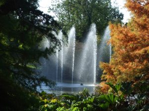
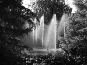
I used the channel mixer to change it to Monochrome and then altered the RGB channels- increasing the red to bring out the right hand tree, and decreasing the blue to increase the contrast in the water jets.

The next thing to do was to to Dodge and Burn the highlights, midtones and shadows. Dodging adds white, and burning adds black.